
Start With the Proof Type and the Right Version
Before you look at colour or layout, confirm what kind of proof you have in front of you. A hard copy proof helps you check page order, margins and how images sit on paper, while a digital proof is useful for spotting text changes and general layout issues. Ask whether the proof reflects the final trim size, the correct paper stock and the right binding method. A file that looks fine on screen can still shift once it is imposed for print.
Check that the version number or date matches the latest approved file. If you have sent a change after the first round of proofs make sure that all corrections are carried through. In busy publishing schedules, one missed update can affect every copy in the run.
- Confirm title, author, issue number and publication date
- Check trim size, page count and binding style
- Make sure the proof is the latest approved version
- Ask whether it is a content proof, colour proof or final machine proof
Read the Text Like a Reader, Not Just an Editor
Even if you have already edited the manuscript, read the proof again from start to finish. Look for missing words, repeated lines, broken paragraphs and headings that fall at the bottom of a page. A final proof should also catch widowed lines, awkward hyphenation and any change in meaning caused by a late correction. Pay special attention to credits, captions, tables and running headers because these often slip through when the main body text is already sound.
Check names, dates, contact details and page references carefully. A small typo on page 3 can become a large problem once the whole print run is packed and dispatched across Johannesburg, Pretoria or further afield. If your publication carries legal notices, ISBN details or contributor notes, verify every character.
- Spelling and grammar throughout the publication
- Headings, subheadings and page numbers
- Captions, captions labels and photo credits
- Tables, charts, references and footnotes
- Contact details, ISBNs and legal text
Check Colour, Images and Print Quality
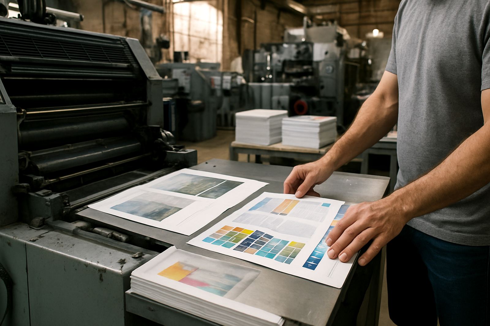
Colour shifts are common between screen and print, so compare the proof against your expectation for skin tones, corporate colours and solid blocks. If you are printing a magazine with photographs, check that the images are clear and not grainy, too dark or washed out. For book covers, inspect the blacks, gradients and any spot colour areas where a change in tone will be obvious once the job is bound.
Look at the sharpness of logos, line art and small type. Fine detail can soften if images are too low in resolution or if black text is built from multiple colours. On coastal jobs humidity can also affect paper movement, so ask whether the stock and finishing chosen suit the conditions where the books will be stored and delivered.
- Image resolution and sharpness
- Colour consistency across pages and sections
- Black text and fine lines staying clean
- Background shades, gradients and logo colours
- Any image cropping or bleed issues
Inspect Pagination, Binding and Finishing Details
In saddle stitched work, the centre pages must open properly and the page sequence must follow the imposed order. In perfect bound or case bound books, confirm that the spine text reads correctly and that nothing important is too close to the gutter. A proof should show whether the trim leaves enough room for page numbers, chapter openers and artwork near the edges.
Finishing can change the final look quite a bit, so review lamination, foil, die cutting and section sewing details if they form part of your job. If a cover has a matte finish or foil element, confirm the exact position and that the effect does not interfere with readability.
- Correct page order and pagination
- Spine text, gutter space and inner margins
- Trim and bleed on all edges
- Lamination, foil and die cut placement
- Binding style matches the approved specification
Use a Practical Sign Off Checklist Before You Approve
Keep your approval process simple and disciplined. Read the proof once for content and once for presentation. If possible, have two people review it, because a fresh pair of eyes will often catch something the main editor has missed. For publishers and businesses managing multiple titles, use the same checklist every time so nothing gets overlooked when deadlines are tight.
If you are unsure about one item, flag it before you sign off. It is always easier to correct a proof than to deal with a full print run that carries the same error across hundreds or thousands of copies.
- Title, subtitle and author name checked
- All corrections clearly marked and understood
- Images, captions and charts approved
- Binding and finishing confirmed
- Final sign off given by the right person
What to Do When You Spot an Error
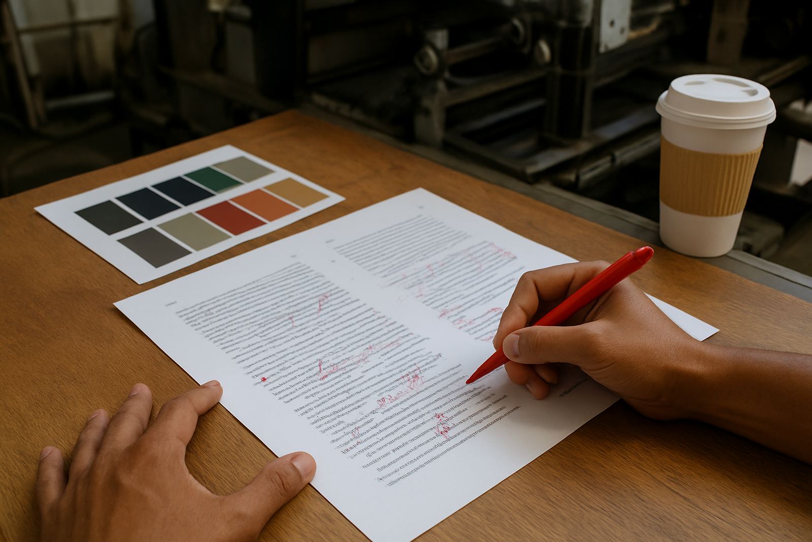
If you find a mistake, mark it clearly and explain it in plain terms. Avoid sending vague notes like “fix this one” because the production team needs to know exactly what to change and where. Give page numbers, line references or image names where possible. If the correction affects layout, ask whether it will cause text reflow, a page count change or a new proof round.
For larger projects, keeping the schedule on track matters. Delays at proof stage can affect press bookings, finishing and dispatch, especially when books are being sent to publishers in different provinces. Good proofing is not about being fussy, its about avoiding unnecessary reprints and protecting the final result.
Printing House works with publishers, authors and businesses across South Africa from Industria in Johannesburg, with nationwide delivery arranged from the production floor through to packing and dispatch.