
Start With the Job the Cover Must Do
Before choosing a finish, think about where the publication will live and how it will be handled. A training manual used in offices across Johannesburg needs different protection from a seasonal magazine that moves through shops, courier bags, and reading rooms. The cover should support the content, not fight it.
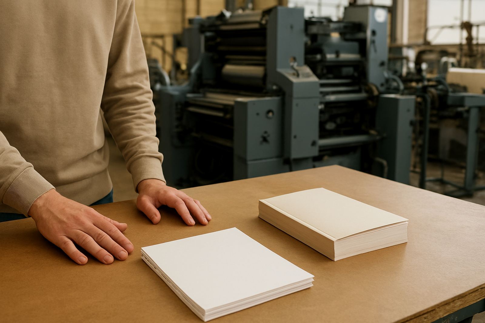
At Printing House we look at run size, paper type, binding method, and the final use before recommending a finish. A soft cover with perfect binding, for example, often needs more protection on the outside than a stitched publication that opens flat for longer reading. For publishers in South Africa, this step is important because many titles travel long distances, from Industria to Cape Town, Durban, Pretoria, and smaller towns where the books still need to arrive looking clean.
- Ask who will handle the publication most often.
- Check whether it will be displayed, posted, or filed away.
- Match the finish to the binding and cover stock.
- Consider humidity, courier wear, and storage conditions.
Lamination Options and What They Change
Lamination adds a thin protective layer to the cover. It helps against scuffing, moisture, and finger marks, which is useful for books that will be moved around a lot or stored in humid areas such as the coast. In practical terms, lamination can add years to the life of a cover, especially where publications are handled daily.
Gloss lamination gives strong colour and a sharper look. Matt lamination offers a more restrained finish and reduces glare under office lighting or retail lights. Soft touch lamination has a smooth feel that suits premium titles, annual reports, and presentation pieces. The choice should be based on the image you want and the amount of wear the cover will face.
- Gloss: strong colour and clear contrast.
- Matt: lower shine and better readability.
- Soft touch: smoother feel for a higher-end result.
- Protective value: useful for couriered and high-handling jobs.
Foil Finishing for Titles That Need Presence
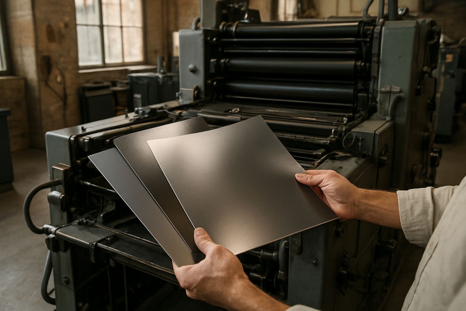
Foil finishing is used when you want the title, logo, or key detail to stand out with a metallic or coloured effect. It works well on limited edition books, gift titles, corporate documents, and special issue magazines. Foil should be used with care because too much can overcrowd a cover and make it look busy instead of well planned.
The best foil work starts in prepress. The artwork must allow enough space for the detail, and the cover stock must be suitable for clean application. Small type, fine lines, or crowded layouts can cause trouble during finishing, so a simple layout often gives the best result. Gold, silver, copper, and strong colour foils each create a different mood, but the purpose stays the same, which is to draw attention to the right part of the cover.
- Use foil for titles, accents, or branding marks.
- Keep the design simple around the foiled area.
- Check that the substrate can take the finish neatly.
- Test the balance between foil, image, and text before final approval.
Texture, Varnish, and Tactile Detail
Not every finish needs to be shiny. Texture can be created through the stock itself, through special coatings, or through finishing methods that give the cover a distinct feel. A textured cover can suit craft books, premium catalogues, and publications where touch matters as much as appearance. It is a simple way to give a publication a clearer identity without overloading the artwork.
Where the cover needs an extra layer of protection but the client does not want lamination, a clear coating may be considered. This can add scuff resistance and a light change in sheen. For jobs that need a more natural feel, an uncoated cover stock may work well, but only if the handling conditions are controlled. In South Africa, where a courier bag may sit in heat or a stack of magazines may move through a busy reception area, the finish should be chosen with real use in mind.
Texture works best when the paper, ink, and binding are planned together. A good-looking cover that cracks at the spine or marks too easily will cause problems later.
How to Choose the Right Cover Finish in Four Steps
If you are comparing options, use a simple process. This keeps the decision practical and reduces the risk of choosing a finish that looks good on paper but fails in use. It also helps when you are planning several titles at once, which is common for publishers and businesses with annual series or seasonal print runs.
- Define the purpose of the publication.
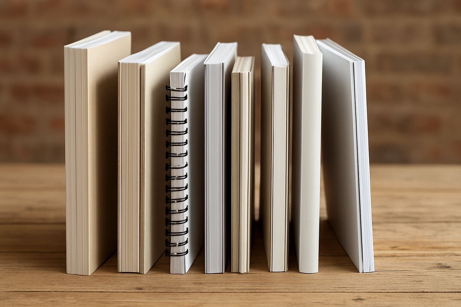
- Choose the binding first, then the finish.
- Match the finish to the budget and quantity.
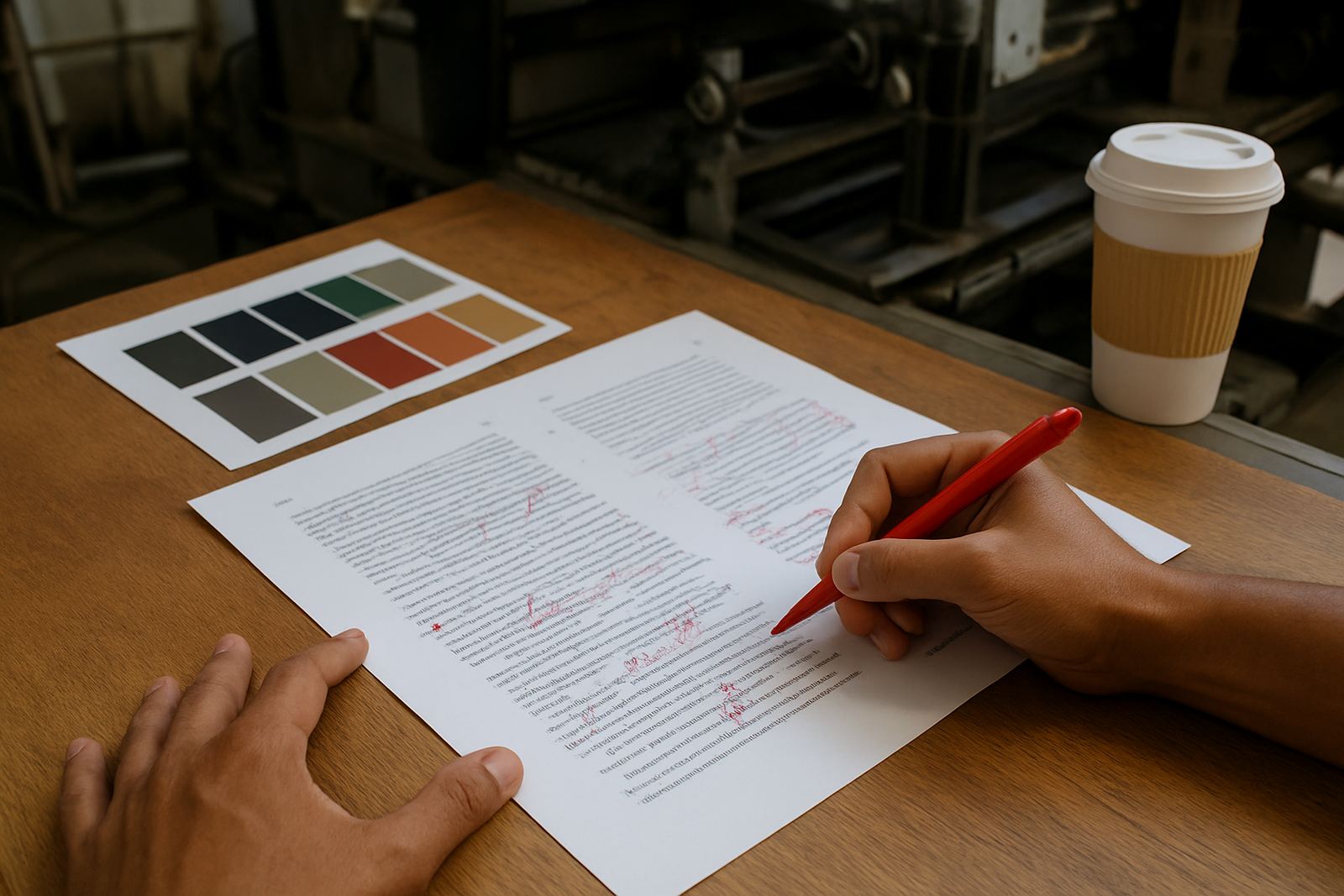
- Request colour proofing or a finish sample where needed.
For shorter runs, the finish must still justify itself. For larger runs, the cost per unit often becomes easier to manage, especially when the publication will be widely distributed. Whether the job is heading to Sandton boardrooms or being packed for national delivery, the finish should be decided with storage, handling, and final presentation in mind.
Practical Checks Before Approval
Before a cover is approved, it helps to run through a final checklist. This avoids delays at press and prevents avoidable reprints. In our experience, most finish problems come from artwork that was not checked for folding lines, image bleed, or foil placement. A few minutes of checking can save a lot of time later.
- Confirm spine width, trim size, and bleed.
- Check that text does not sit too close to edges or folds.
- Make sure images stay sharp after lamination or coating.
- Verify that foil or texture areas are separated cleanly in the artwork.
- Ask whether the finish will affect writing, stacking, or packing.
For magazines and books moving through Johannesburg Central, Randburg, Roodepoort, Midrand, Pretoria, and the East Rand, neat finishing also helps with retail presentation and dispatch. A cover that arrives clean and well protected reflects well on the publisher and on the print job as a whole.
At Printing House, our team in Industria checks these details with the full production flow in mind, from prepress through to packing and dispatch. That includes working with Busisiwe Motaung on production planning, Johan van der Merwe on prepress checks, and Leanne Naidoo on logistics so the finish chosen on paper still works once the job leaves the press.