
Start With a Clean File Before Any Proof Leaves Prepress
Most colour trouble starts in the artwork, not on the press. Before a book or magazine goes to proof, every image should be checked for the right colour mode, resolution and embedded profiles. Text, rules and tints also need a careful eye because a small layout error can change how a page prints, especially on coated stock where fine detail shows up quickly.
At our Industria base in Johannesburg, we see a lot of work from publishers who need repeatable colour across multiple print runs. The safest approach is simple: agree the intended paper, check the file against the final trim size, and confirm that linked images are the correct quality for offset printing. If a job includes both heavy photography and text-heavy pages, the prepress check should flag any weak images before they become a production issue.
- Use one approved artwork version for all pages and covers.
- Keep blacks, greys and brand colours defined consistently throughout the file.
- Check overprints, bleeds and thin white lines around solid colour areas.
- Allow enough time for a proper prepress check, especially on large magazines or annual reports.
Proof Against the Paper and Finishing, Not Just the Screen
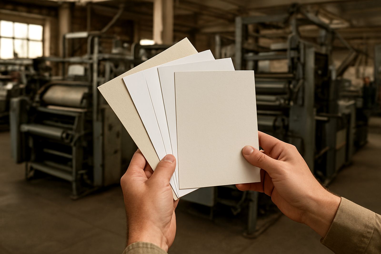
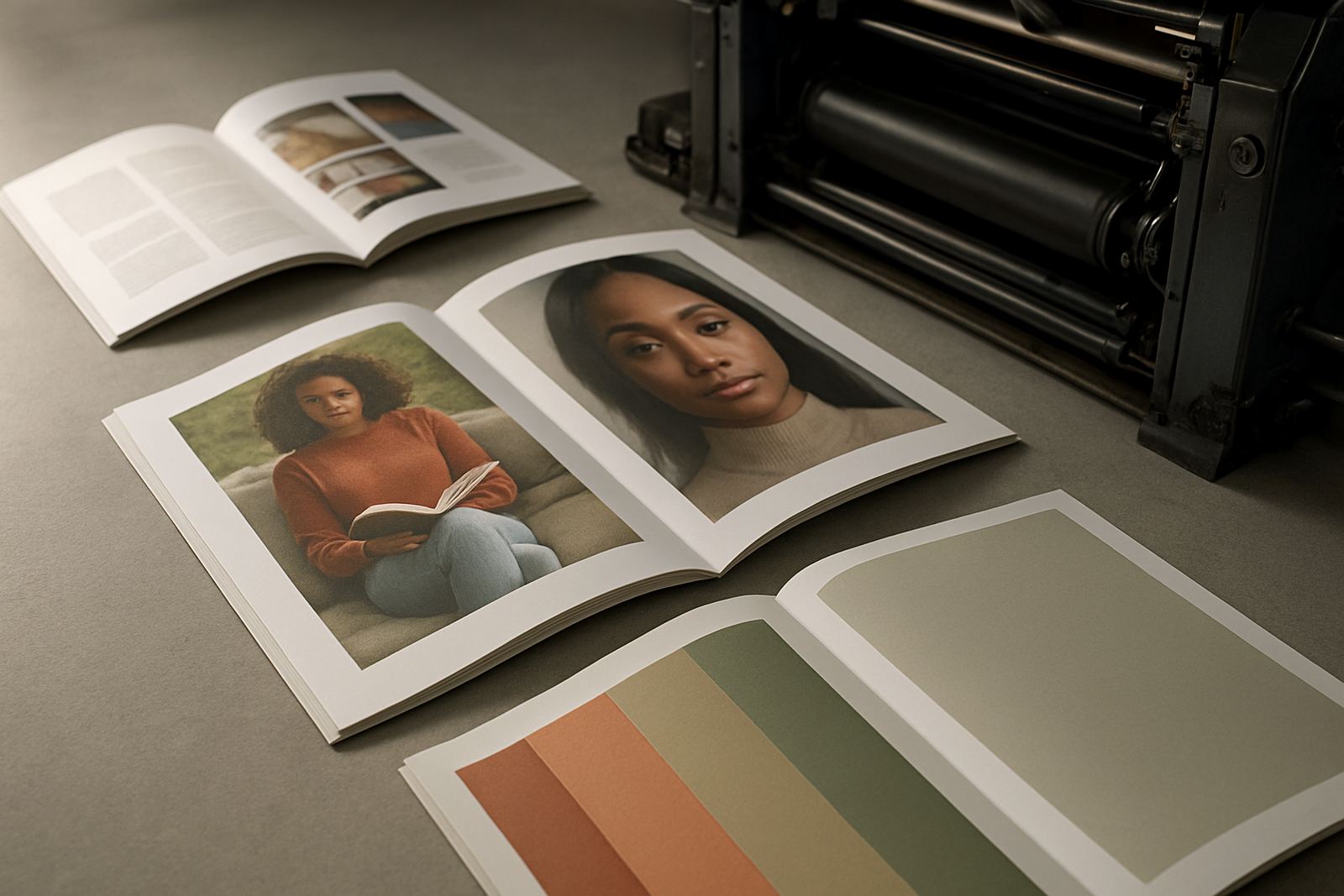
A screen can only tell you so much. Real colour depends on paper brightness, coating, ink coverage and finishing choices like lamination or foil. A glossy cover may make colours appear deeper, while an uncoated interior often softens contrast. That is why proofing should match the final production as closely as possible, not just the picture on a monitor.
For publishers handling books with coated jackets and uncoated content pages, this matters more than many people realise. A photo that looks strong on a bright display may print a touch flatter on matt stock, and a pale background can shift warmer on cheaper paper. If the job is going to Pretoria, Sandton or further afield by courier, the proof has to settle the question before the pallets leave Industria.
- Ask for a proof on similar paper where possible.
- Compare key images, skin tones and logos under neutral light.
- Check how colour changes after lamination or foil finishing.
- Keep a signed proof on file for repeat orders and reprints.
Choose the Right Print Method for the Job Size and Colour Range
Offset printing gives excellent control on longer runs and is usually the right choice where consistent colour across many copies is essential. Flexo printing is better suited to certain packaging and shorter production requirements, but it also needs careful set-up to keep tones steady. The method matters because each process handles ink, pressure and drying in a slightly different way.
For magazines, catalogues and books, offset is often preferred when the client needs tight image detail and strong repeatability. For some folded inserts or special applications, flexo can be the practical option. The key is to match the process to the job instead of asking one method to do everything. That saves time, lowers waste and avoids the frustration of chasing a colour that will never sit quite right on the wrong substrate.
A good production team will look at the page count, paper choice, run size and finishing requirements before recommending a route. That early decision makes colour control much easier later on.
Keep Press Checks Practical and Specific
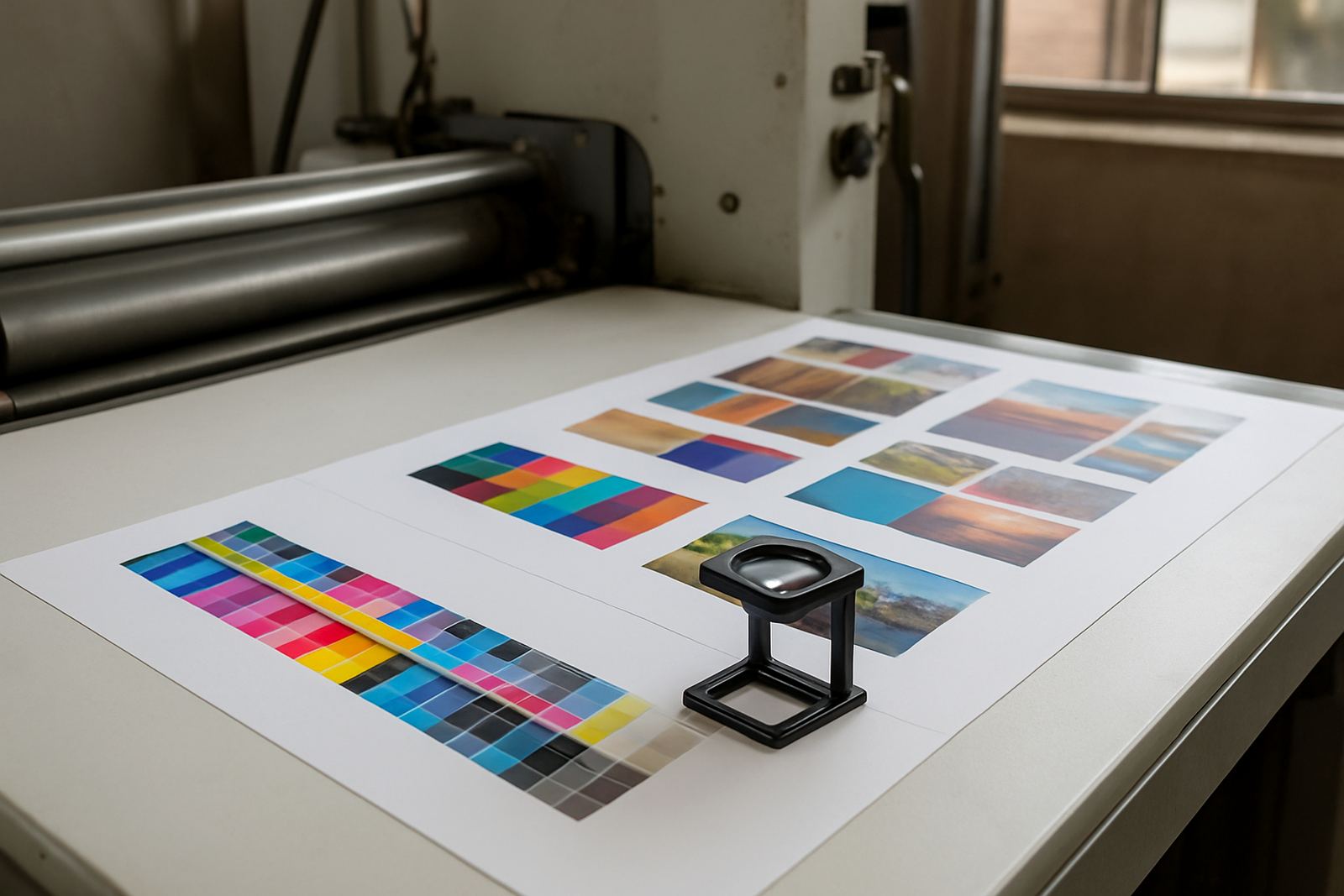
Press checks work best when someone knows exactly what they are looking for. Rather than saying a page looks off, compare it to the approved proof and note whether the problem is density, warmth, contrast or a single colour shift in a logo. This gives the press operator a clear target and keeps adjustments focused. In a busy print room, vague comments waste time and can make the run less consistent.
Oupa Hlungwani often reminds clients that colour is not just about taste, it is about control. A magazine cover may need a deeper black, while a children’s title may need brighter primaries. The point is to agree the aim early, then check the same reference throughout the run. In Johannesburg heat and with load-shedding interruptions, the small checks matter even more because equipment restarts can affect consistency if the job is not monitored closely.
- Use the approved proof as the only reference on press.
- Check the first sheets and then sample again at set intervals.
- Record any press adjustments so the next reprint starts from the same point.
- Watch for drying changes on heavy ink coverage and solid backgrounds.
Control Finishing So the Final Colour Stays True
Finishing can alter how colour reads once the printed sheets are bound. Saddle stitching, perfect binding, case binding and section sewing each place different demands on the printed sheets. If trims are off, or if pages sit under tension in the binding stage, colour blocks and photos can appear inconsistent from copy to copy. That is why finishing must be planned together with the print run, not after it.
Coastal humidity is another factor for publishers sending books nationwide. Sheets that absorb moisture during storage can behave differently during binding and packing, so clean stacking and careful dispatch are part of colour control too. Our bindery team, including Farieda Adams and Leanne Naidoo, keeps an eye on how print, trim and packing line up. It is not glamorous work, but it protects the finished publication. A neat finish makes the colour look more intentional, and that counts.
For covers, lamination and foil finishing should be tested on a sample first if the title has sensitive brand colours. What looks right in a proof can shift once a sheen or metallic effect is added.
Set One Colour Standard for Reprints and Nationwide Distribution
Publishers working across Johannesburg, Midrand, the East Rand and other regions need repeatable results from one print run to the next. The easiest way to achieve that is to keep a simple colour record for each title. Store the approved file version, paper spec, proof notes and finishing details together. When the next run comes in, the production team can match the original rather than starting over.
This also helps when stock is packed and dispatched to more than one destination. If one batch goes to a warehouse in Randburg and another to a client in Pretoria, both need to look the same when opened. The same is true for books sold through different channels or magazines sent to multiple branches. Colour control should not depend on memory, because memory is where mistakes creep in.
- Keep a job sheet with paper, ink and finishing notes.
- Save the approved proof and final sample together.
- Use the same file version for reprints unless changes are formally approved.
- Review feedback after delivery so the next run can be improved.
A Simple Working Habit That Saves Time and Waste
The most reliable colour control habit is also the simplest one: check early, agree clearly and keep the same reference from start to finish. When authors, publishers and print teams do that, the whole job becomes easier to manage. There is less guesswork, fewer reprints and less waste on paper and ink.
That approach suits the way we work from Industria. Whether a title is heading to a Sandton office, a Roodepoort warehouse or a printer-managed dispatch point somewhere else in South Africa, the goal is the same, steady colour that matches the approved standard. In print, consistency is not luck. It is a process, and if the process is tight the result usually is too.