
Why spine width starts with the page count
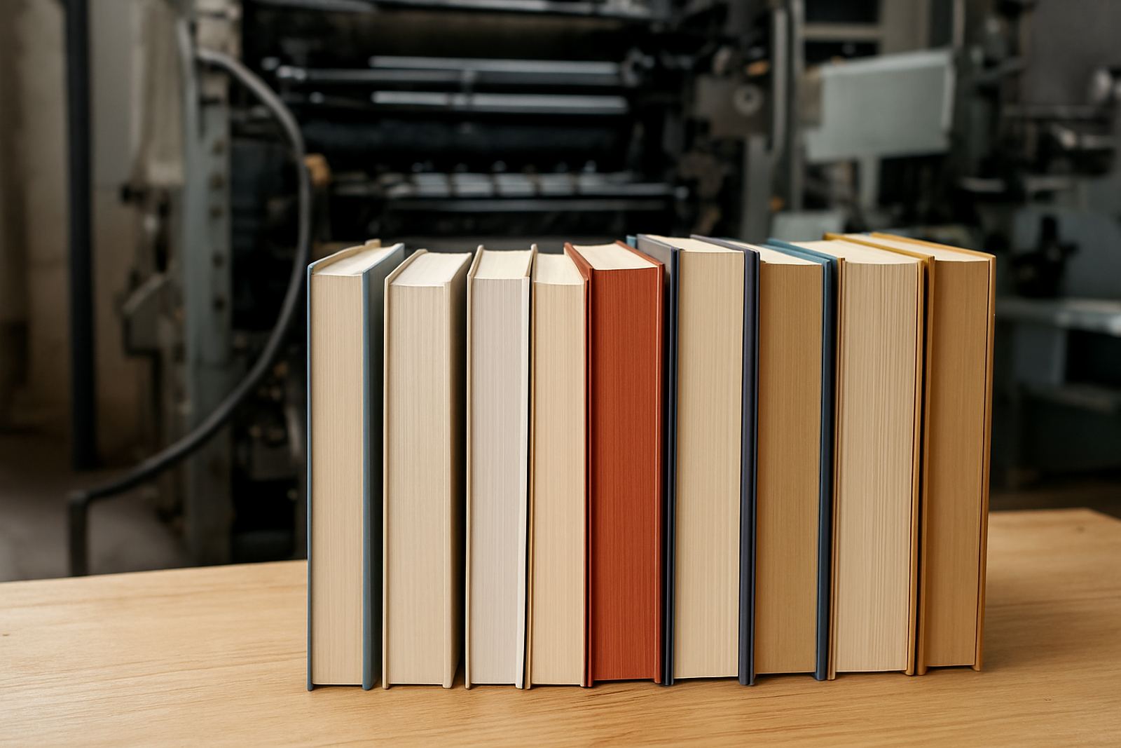
Spine width is mostly driven by the number of pages, the paper stock and the binding method. In perfect binding, the inner pages are glued into a wraparound cover, so the spine must allow for the thickness of the text block as well as a little movement during trimming. A 64 page booklet on 70gsm paper will not need the same spine as a 256 page annual report on a heavier stock.
Publishers often ask for a quick spine measurement before artwork is finalised, and that is the safest route. If you guess too early, the title can shift off centre or the spine can end up too narrow for the text. If the spine is too wide, the book may look bulky and the glue line can appear untidy. In our Johannesburg production line we see this most often when a project changes paper or page count after design has started.
- Page count
- Paper weight and bulk
- Glue build and trim allowance
- Final book size after trimming
Cover setup that keeps the spine true
The cover file needs to be built around the finished spine measurement, not the other way round. That means allowing for the front cover, spine, back cover and the hinge or crease areas on either side of the spine. If the scores are too tight, the cover may crack. If they are too loose, the book can sit awkwardly on a shelf and the spine may not read square.
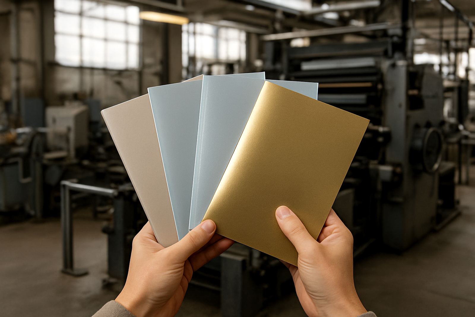
We advise checking the cover wrap against the final trimmed size before print release. On heavier books, especially case bound jobs or titles with coated covers, the cover stock needs enough strength to hold shape in delivery trucks and on shelves. Johannesburg heat, dusty storage areas and coastal humidity up in Durban or down in Gqeberha can all affect how a cover behaves after binding, so it pays to specify the right board and lamination from the start.
- Confirm the trimmed page size
- Set the spine width from the final page block
- Allow proper hinge space on both sides
- Choose a finish that can handle handling and stacking
Title readability on narrow and wide spines
Spine titles are small, so readability matters more than decoration. On narrow spines there may only be room for a short title, while wider spines can carry the title, subtitle, author name and publisher mark. The type needs enough size, contrast and breathing space to stay legible after trimming and folding.
A common mistake is using a font that looks elegant on screen but disappears once the book is on a shelf. Another issue is placing text too close to the hinge line where it can distort slightly. For practical results, keep the title clear and leave enough margin so the type is not crowded by lamination gloss or foil detail. In some cases a simple spine design reads better than a busy one, especially for trade books that must be identified quickly in a warehouse.
- Use strong contrast between text and background
- Keep critical text away from the hinge area
- Choose fonts that hold up at small sizes
- Test the spine at actual size before approval
When binding method changes the look of the spine
Perfect binding is often chosen for magazines, catalogues, novels and reports where a clean square spine is needed. But the final result can change depending on the paper, the glue and whether the job needs extra finishing. A softcover publication with a laminated cover will behave differently from a section sewn book with a thicker text block.
Section sewing can improve opening and durability on larger books, while case binding gives a more rigid feel for premium publications. For standard perfect bound work, the key is making sure the spine thickness is measured from the assembled pages, not estimated from the design layout. If the job will be couriered nationwide from Industria to clients in Pretoria, Polokwane or Cape Town, the binding choice should also take transport wear into account.
Thicker books usually need more attention at the spine because the glue has to hold more pages. That is why prepress checks matter before anything goes to press.
Practical checks before artwork goes to press
Before final approval, it helps to run a short checklist with your printer or production team. This avoids expensive reprints and keeps the publication schedule on track, which is vital when a launch date or distribution window is fixed. In busy seasons, especially before school terms, trade shows or year end reporting, even a small spine error can hold up packing and dispatch.
- Confirm the final page count
- Check the paper stock and bulk
- Measure the spine from the actual text block
- Set the cover with proper bleed and scores
- Review title placement at full size
- Approve a proof before mass print
We also recommend checking how the spine looks under different lighting. Matte and gloss finishes can make text appear lighter or darker, and a colour that looks strong on a monitor may read differently on press. A proof helps spot these differences early.
A Johannesburg example from a short run magazine
A 120 page industry magazine printed for a client in Sandton and distributed across Gauteng needed a spine carrying the issue number, masthead and a small strapline. Because the publication was going into a perfect bound format, the page count and paper choice had to be locked before the spine could be set correctly.
Once the text stock was confirmed, the cover layout was adjusted so the spine sat neatly between the front and back panels. The title remained readable from arm’s length on a shelf, and the issue held up well during packing, courier handling and repeated opening at events. That is the real test of a good spine: it must look right on screen, in the press room and after delivery.
For publishers working nationwide, this kind of planning saves time later. It also means the finished publication arrives looking like it was meant to be there, not patched together at the last minute.