
Start with the job’s purpose and audience
The right paper begins with how the publication will be used. A novel, a training manual, a glossy product catalogue and a church bulletin all need different stock because people handle them differently and expect different results. If the piece will be read for long periods, comfort matters. If it is image led, the paper needs to hold detail and colour without looking dull or uneven. For many South African publishers, the decision also comes down to freight costs, turnaround time and whether the stock must travel well from Johannesburg to other provinces.
We usually advise clients to answer three questions first: who will read it, where will it be used, and how long must it last? A short life brochure can use a lighter sheet, while a reference book or magazine that will be handled often needs better opacity and stronger binding support. In humid coastal areas, paper choice also affects curl and finish stability, so it is worth planning for the climate as well as the content.
- Will people spend minutes or hours with it?
- Does the job rely on text, photos, charts or all three?
- Will it be posted, packed, stored or carried around often?
- Is it for retail sale, internal use, or event distribution?
Choose paper weight for feel, strength and page count
Paper weight is measured in gsm, and it changes both the feel and the cost of the finished piece. Lighter papers are usually cheaper to print and post, but they can show more show-through when text is dense. Heavier papers feel more substantial and can suit covers, art books and premium magazines, though they add cost and bulk. For a 64 page magazine, the inner stock choice can change the spine width and the way the book opens. That matters for perfect binding and case binding alike.
As a rule, text pages often sit between 70gsm and 120gsm depending on the look required, while covers often range from 200gsm upward. If a publication has heavy image coverage, a slightly heavier sheet can improve the readabilty of photos and reduce transparency between pages. For mailing or wide distribution, every extra gram has a cost, so it helps to balance presentation against postage and freight. We also check whether the selected stock can run cleanly on the chosen press without causing registration issues or feed problems.
- Lighter gsm: lower cost, less bulk, better for long runs
- Mid gsm: good balance for magazines, manuals and catalogues
- Heavier gsm: premium feel, stronger covers and less show-through
- Very heavy board: suited to covers, tabs and special finishing
Match coating and finish to the type of content
Finish changes how paper behaves under light and touch. Uncoated paper gives a natural look and is easy to read for long text, while coated stock gives sharper image reproduction and richer colour. Matt coated paper softens glare and works well for magazines and premium reports, while gloss coated paper can make photographs and colour blocks stand out more strongly. If the publication will be read under bright office lighting or in schools, a matt or uncoated option may be more practical.
Not every project needs a shiny finish. In fact, many book publishers prefer a calm, low-glare surface because it supports long reading sessions. For business catalogues, a coated sheet can help product shots look cleaner and more consistent. We can also advise on cover lamination, foil finishing and die cutting when a client wants extra protection or a more tactile result. In Johannesburg and across Gauteng, many clients ask for paper that looks good but still folds, trims and binds properly after printing, especially when deadlines are tight.
Think about print method before you approve stock
Offset printing and flexo printing do not behave the same way, so the paper must suit the method. Offset is often chosen for books, magazines and higher detail work because it handles fine type and images well on a wide range of stocks. Flexo is more common where speed, packaging style output or specific roll-fed applications are involved. The sheet or reel needs to work with the press, dry correctly and maintain colour consistency through the run. If the stock is unsuitable, you can lose time on make-ready and waste paper during testing.
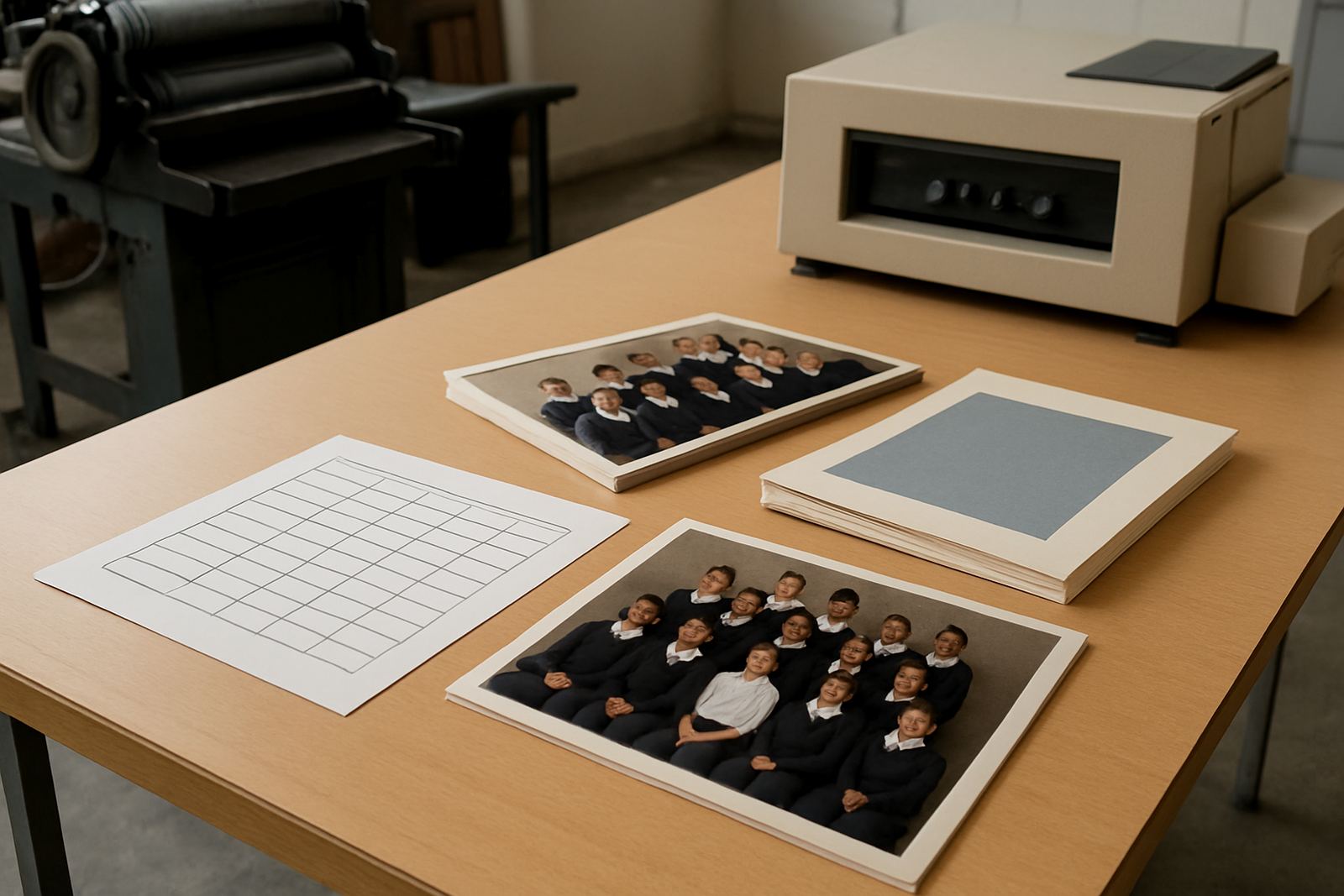
Prepress checks are essential before any paper is locked in. We look at file build, ink coverage, screen ruling and colour proofing to make sure the paper can carry the job as intended. Some stocks absorb ink more, which affects density and sharpness. Others can show minute surface variation that becomes obvious in solid colour areas. When a title has both text and photographic sections, we sometimes recommend a split approach, using a different stock for the cover and inner pages so the final piece performs well from start to finish.
Balance budget against durability and finishing
Paper is one of the biggest cost drivers in print, but the cheapest option is not always the most economical. A lighter sheet may save money upfront yet result in reprints, poor image quality or a publication that feels weak in the hand. On the other hand, choosing a stock that is too heavy can push the job over budget without adding much value. The best choice is usually the one that matches the publication’s purpose, binding method and expected lifespan. For example, saddle stitched booklets need enough stiffness to sit neatly but not so much thickness that the spine becomes awkward.
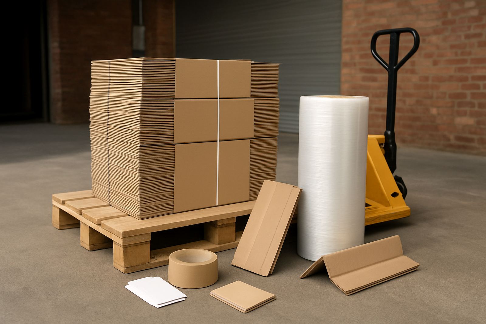
Budget planning should also include finishing, packing and dispatch. A heavily finished cover with lamination, foil or die cutting may justify a slightly simpler internal stock. If the job must go to Pretoria, the East Rand, Sandton or further afield, packing strength matters too. We can advise on carton sizes, stack limits and dispatch planning so the stock arrives in good condition. That is especially useful for publishers sending mixed print runs to multiple locations nationwide.
- Check the total job cost, not only paper price per sheet
- Allow for binding method and spine thickness
- Include packing and delivery when comparing options
- Choose durability based on how long the item must last
Use a simple approval checklist before printing
Before a print run starts, it helps to approve the paper with a clear checklist. This avoids back-and-forth later and keeps the production plan on track. Our team works with publishers, authors and businesses from Industria, Johannesburg Central, Midrand, Randburg, Roodepoort, Pretoria and the East Rand, so we know how important it is to settle the stock early. A few sample sheets can save a lot of time, especially on jobs with colour sensitive artwork or detailed text.
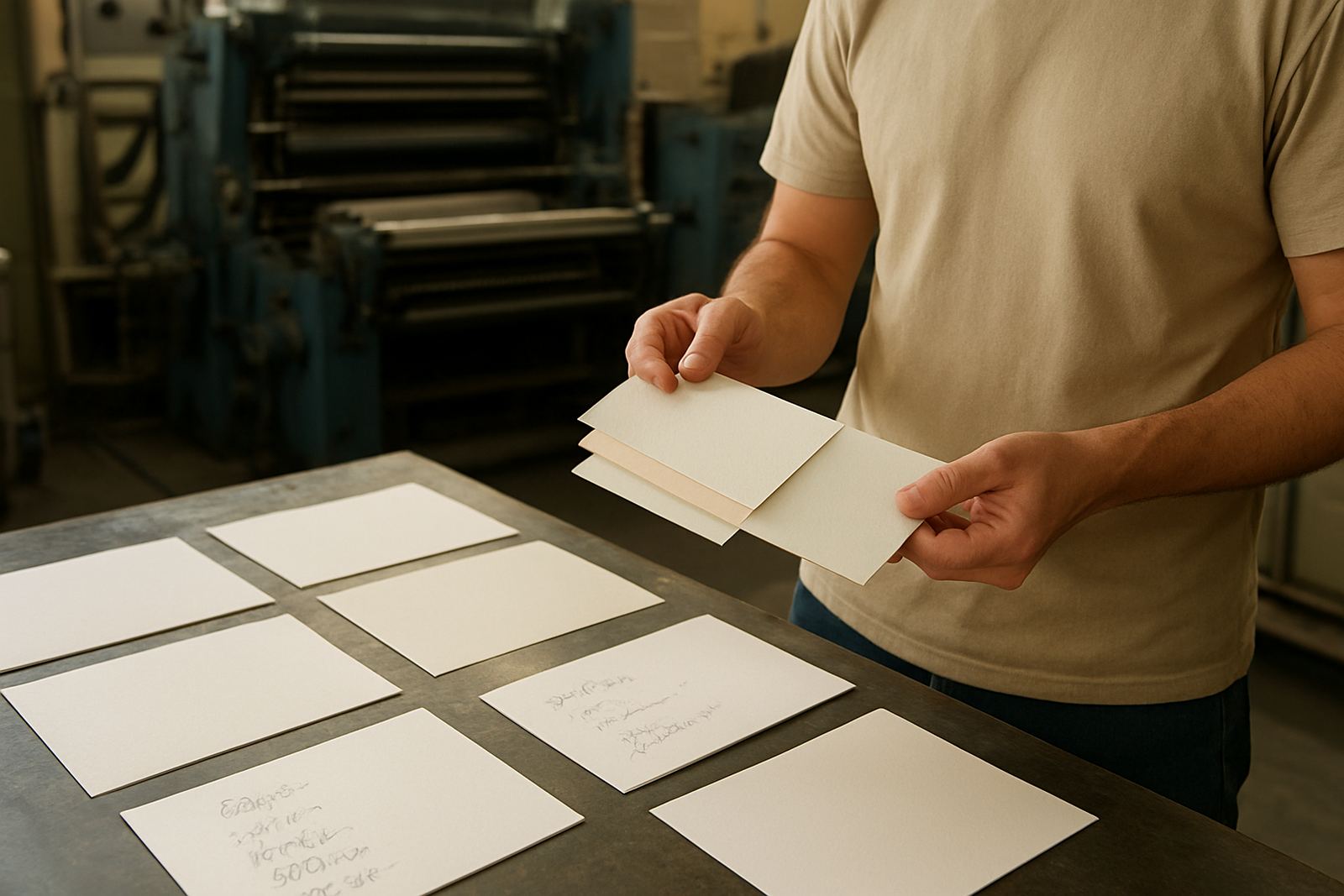
Ask for samples where possible and compare them under natural light as well as office light. Touch the sheet, check opacity, and view it with the actual artwork if you can. If the publication will be stored for months, consider whether the paper may yellow, curl or mark over time. The aim is not only to choose a paper that looks good on the day of approval, but one that still performs when the finished books or magazines are on a shelf or being handed out.
- Confirm gsm, finish and sheet size
- Check how text reads on the chosen stock
- Review image clarity and colour appearance
- Approve samples against the real print content
- Match the paper to the binding method and delivery plan