
Why cover finish matters before the first copy leaves Industria
A good cover finish starts with the kind of book you are printing and where it will be used. A trade paperback that sits on a bookstore shelf in Sandton needs a different finish from a training manual that gets handed out in Pretoria and moved between sites. The right choice can reduce scuffing, keep ink looking sharp, and help the book survive packing, courier trips and frequent handling.
In Johannesburg, dry winter air and busy distribution schedules can be hard on unprotected covers. At the same time, coastal humidity on deliveries to Durban or Gqeberha can test glued edges and coated boards. Finishes are best considered before print starts, not after. A little planning saves reprints and avoids a cover that looks tired before it reaches its audience.
Gloss, matt and soft-touch lamination: the everyday choice
Lamination is one of the most common cover finishes because it protects and changes the feel of the book straight away. Gloss lamination gives a bright, reflective surface that makes photos and bold colour stand out. Matt lamination gives a calmer, less reflective look and is often chosen for serious titles, corporate reports and books with strong typography. Soft-touch lamination has a velvet feel and gives a more premium finish, though it shows marks more easily if the book is handled a lot.
For publishers printing fiction or lifestyle titles, the choice usually comes down to visual style and budget. For a company handbook or conference publication, matt is often safer because fingerprints are less obvious. Gloss can suit books with strong image-led covers, but it can also show scratches if the book is packed too tightly. If you are unsure, ask for a sample or proof so you can compare the options under real light, not just on a screen.
- Gloss: sharp colour, more shine, good for image-heavy covers.
- Matt: clean, low glare, better for text-led covers.
- Soft-touch: smooth feel, premium look, best for shorter print runs or special editions.
Foil, embossing and spot effects when the cover must stand out
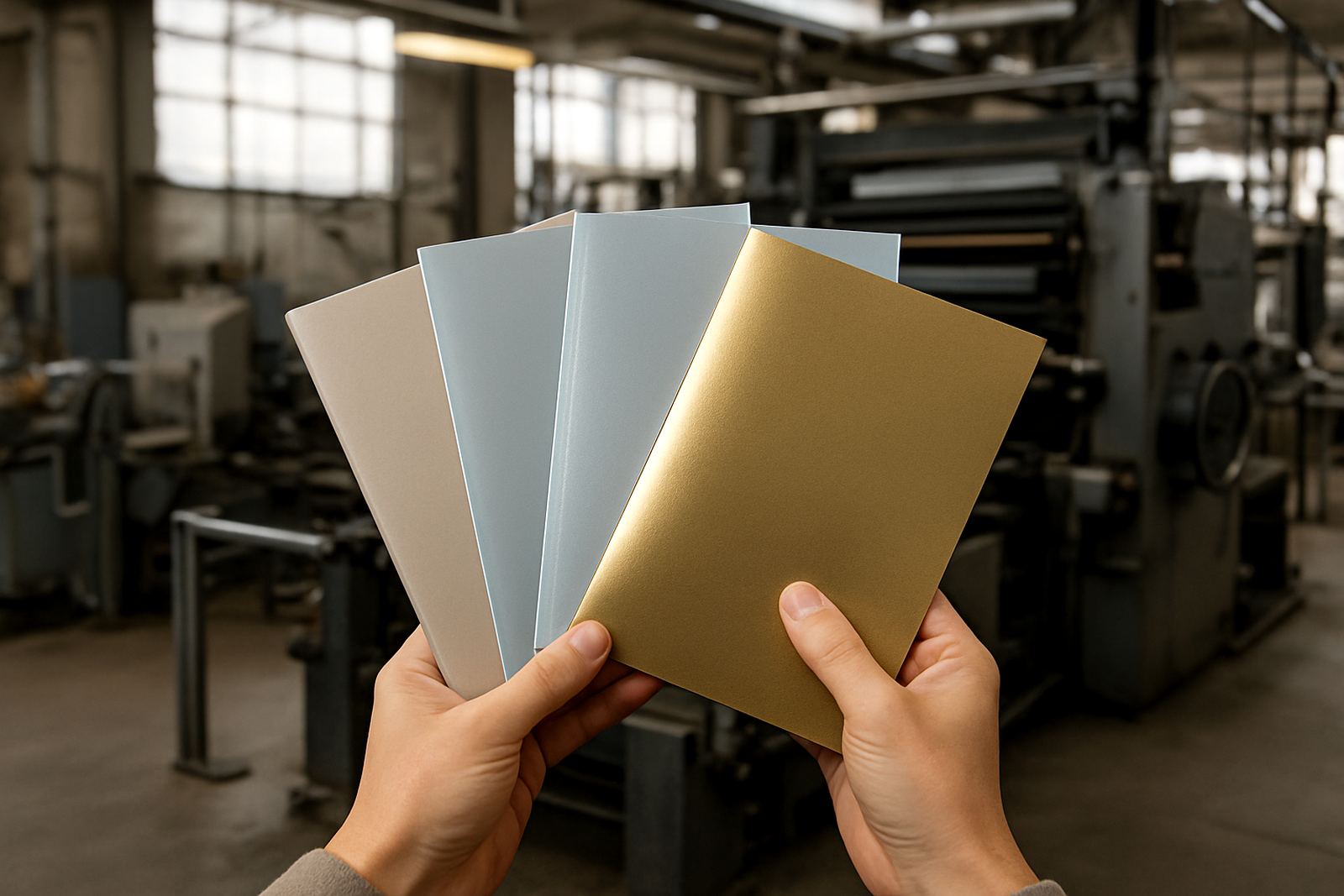
Finishing is not only about protection. It is also about where the eye goes first. Foil finishing can highlight a title, author name or logo in gold, silver or other metallic tones. Embossing raises an area of the cover so it can be felt with the hand, while debossing presses it in for a recessed look. These techniques work well when you want a strong shelf presence without covering the entire cover in decoration.
Spot effects can be used carefully to draw attention to one detail, such as a title, symbol or border. For example, a publisher in Midrand launching a poetry anthology might use matt lamination with a small foil title and embossed motif. The result is subtle but still catches the light on display tables. It is worth noting that these finshing options need accurate prepress setup, because poor alignment will show up quickly once the book is trimmed and bound.
- Use foil for titles, logos or special editions.
- Use embossing for tactile detail and added presence.
- Keep special effects limited if the book must remain cost-conscious.
Choosing the finish for binding style and page count
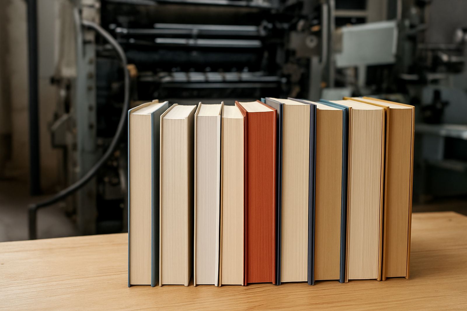
The cover finish must work with the binding method. A perfect bound book needs a cover that can flex at the spine without cracking. A saddle stitched publication, such as a magazine or small brochure, benefits from a cover that folds cleanly and keeps its shape after stapling. Case bound books are more formal and usually need sturdy boards with a finish that can handle handling over many years.
Page count matters too. Thin publications often suit lighter boards and simpler finishes, while thicker books need stronger cover stock and careful scoring. If the cover is too stiff, the spine may not open properly. If it is too soft, the book can feel cheap and wear out fast. Printing House often advises clients on the balance between appearance, binding and durability before production starts, which is especially useful when the same title will be delivered to several provinces at once.
Practical advice for South African print runs and delivery
Local conditions should guide the finish you choose. Books that travel through depots, campus bookshops and municipal offices need covers that hold up to repeated stacking. In Johannesburg and the East Rand, dust and handling are common. In coastal regions, moisture can affect paper and adhesive if the cover stock is too light or the packing is too open. A finish that resists scuffing and edge wear can make a big difference by the time the books reach the final reader.
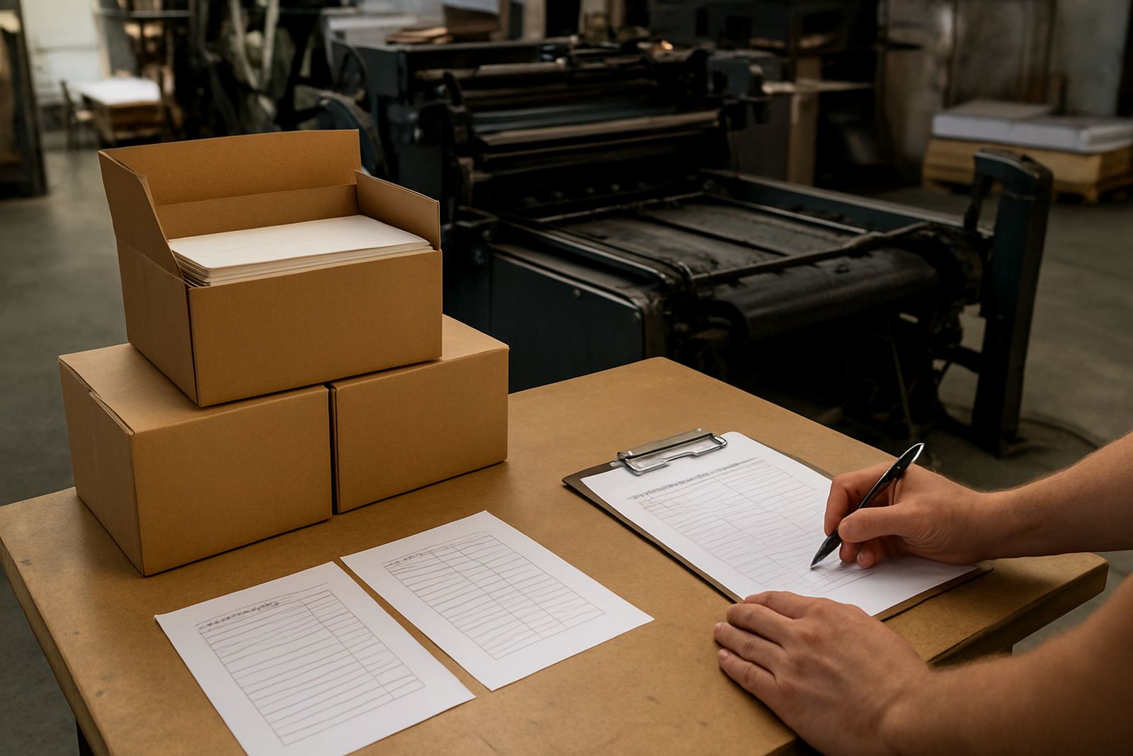
If your print run is going nationwide, think about where the stock will be stored first. A title going from Industria to Cape Town, Bloemfontein and Polokwane may spend several days in transit. That means the cover must survive heat, friction and loading bay handling. A simple rule is this: the more a publication will move, the more it benefits from lamination or another protective layer.
- Choose tougher covers for couriered stock and repeated handling.
- Consider matt lamination for text-heavy books that need a neat finish.
- Ask how the cover will behave at the spine before approving the final file.
How to brief your printer for the right result
A clear brief saves time and avoids surprises. When ordering book covers, share the trim size, page count, binding style, target audience and expected use. If the book is for retail sale, mention whether you want a premium look or a more practical one. If it is a training manual, say how often it will be opened, transported or filed. These details help the production team recommend the most suitable cover stock and finish.
At Printing House in Industria, the process usually begins with prepress checks and colour proofing before any finishing is approved. That matters because a rich black, a fine line or a small foil mark can shift once the file moves into production. A good brief also helps the bindery team plan scoring, lamination and trimming so the cover sits neatly on the finished book. When the finish, binding and packing all line up, the result feels professional from the first touch to the final delivery.