
Why catalogue images fail in print
Most image problems start before the press runs. A picture that looks fine on a phone can still print soft, muddy, or too dark once it is placed into a catalogue and converted for offset or flexo production. The usual causes are low resolution, over-compression, poor colour correction, and images that were never prepared for the paper stock being used.
In print, small faults become obvious. A slightly out of focus product shot may pass online, but on a full page it can make the entire booklet feel rushed. This matters for publishers, wholesalers, and businesses producing catalogues for trade shows, mailers, or sales teams across Johannesburg, Pretoria, Sandton and beyond.
Start with the right source files
The best catalogue reproduction begins with clean originals. Where possible, use high-resolution images shot for print, not screenshots lifted from a website. A strong source file gives the prepress team more control over sharpening, shadow detail, and colour balance before the pages go to plate.
- Use the highest quality image available, ideally at final print size
- Aim for 300 dpi for standard photo reproduction
- Keep product edges clean, especially on white or light backgrounds
- Avoid heavy filters that change skin tones, fabric texture, or packaging colour
- Send final artwork in a print-ready format, with fonts and linked files checked
If a catalogue includes lots of pack shots, furniture ranges, or retail items, consistency matters as much as sharpness. One image that is warmer or cooler than the rest can make the whole spread feel uneven.
Colour proofing saves costly reprints
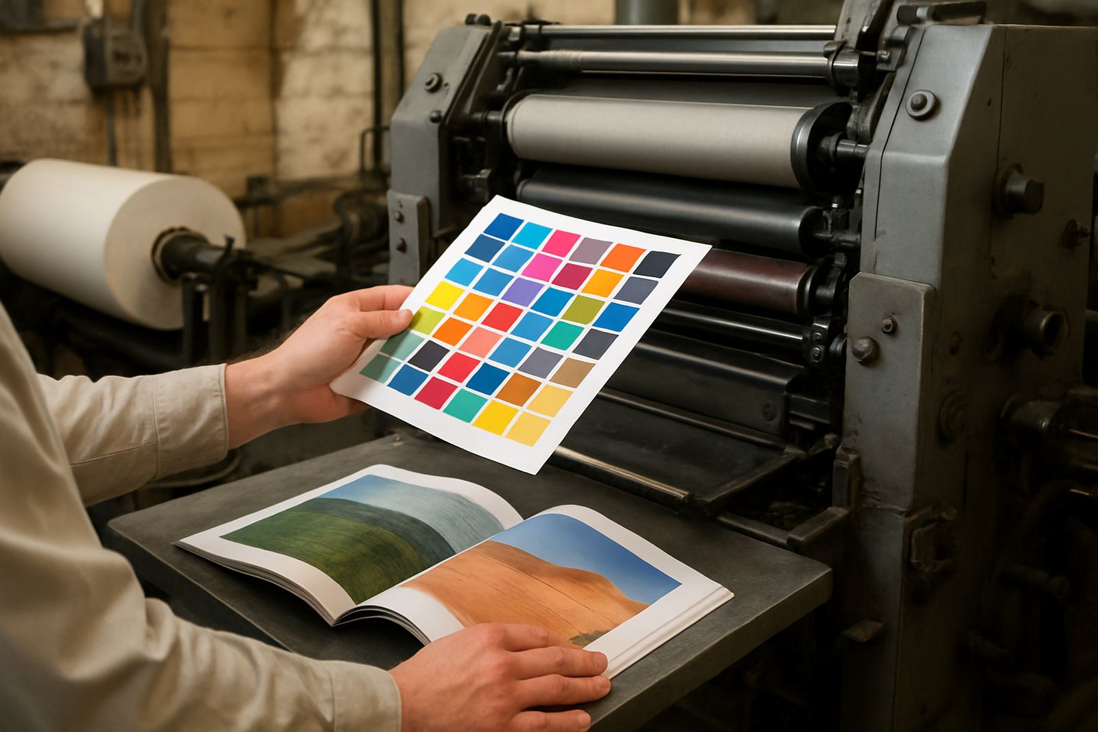
Colour is often where catalogue work goes wrong. A red label that shifts to orange, or a dark navy that prints almost black, can lead to complaints and reprints. That is why proofing is not a box-ticking exercise, it is part of getting the job right the first time.
Good proofing helps match the printed result to the approved artwork and the chosen paper. Matte stock, gloss stock, and coated covers all behave differently, so the same image can look very different from one catalogue to another. In Johannesburg, where many publishers need fast turnaround and delivery to multiple branches, proof approval should happen early so changes do not hold up the press schedule.
- Check skin tones, packaging colours, and logo areas first
- Review dark areas for blocked detail and flat shadows
- Confirm that product whites do not print cream or grey
- Approve proofs under normal daylight if possible
Paper choice affects how images read
Even the best image file can struggle on the wrong paper. Coated stock holds fine detail better, while uncoated paper can soften contrast and mute bright colours. That does not mean one choice is better than the other, only that the image treatment must suit the stock and the purpose of the catalogue.
For product catalogues that need crisp visuals and accurate colour, paper selection should be discussed alongside binding and finishing. A heavy cover with lamination can protect the front and keep handling marks down, while the inside pages may need a finish that supports clear text and clean product shots. In coastal areas, where humidity can affect paper behaviour during storage and dispatch, correct packing also helps the final result stay neat.
For bulk distribution into Sandton offices, Roodepoort showrooms, or Pretoria branches, a catalogue that has been stored and packed properly arrives flatter, cleaner and easier to use.
Finishing details that protect image quality
Finishing is not just about appearance. It also affects how well images survive handling. If a catalogue is folded, stitched, glued, or case bound without considering the layout, important parts of a picture can disappear into the spine or sit too close to a trim edge.
When planning catalogue reproduction, the finishing method should be matched to page count, usage, and distribution. Thick publications with many product photos may need perfect binding or section sewing, while slimmer promotional catalogues can work well with saddle stitching. Lamination, foil finishing, and die cutting can add value, but they must never interfere with the image area or reduce legibility.
- Keep key product details away from the spine and trim line
- Allow safe margins for foldovers and binding loss
- Use lamination where frequent handling is expected
- Choose the binding method based on page count and how the catalogue will be used
A practical Johannesburg example
A publisher in Industria may be printing a catalogue for trade buyers across Gauteng and the rest of the country. The images need to show exact fabric colour, surface texture, and pack size, while the printed books must travel from the bindery to multiple destinations without edge wear. In that case, prepress checks, proofing, and careful packing all matter as much as the presswork itself.
The job might start with a press-ready file review, then move through colour proofing, image correction, and final sign-off before printing begins. After print, the pages are finished, checked, packed and dispatched in sequence so the catalogue can reach Midrand, Randburg, the East Rand, and other delivery points on time. Good catalogue reproduction is not about luck, it is about control from the first file to the last carton.
That is especially important when a catalogue is tied to a sales window or launch date. If the images are sharp, the colours are steady, and the binding suits the number of pages, the finished publication feels professional from cover to cover.
What to check before you approve print
Before any catalogue goes into production, review the image pages with a print eye, not just a screen eye. Ask whether every product can be identified quickly, whether the colours are true, and whether any image looks too soft once set against body copy and prices.
- Are all key products shown at a clear size?
- Do the shadows and highlights still show detail?
- Have all images been checked for colour shifts?
- Is the spine, trim, and fold area clear of important visuals?
- Have final dispatch quantities and delivery areas been confirmed?
When those points are covered, catalogue images stay sharp, appealing, and useful for the reader. That is the standard worth aiming for in any publication, whether it is for a publisher, retailer, or business that needs a clean printed presentation.