
Why foil still works on a printed cover
Foil is often used where a cover needs a stronger first impression but must still stay readable and practical. On book jackets, magazine covers and annual reports, it catches light in a controlled way so the title stands out on a shelf or reception table. That matters in a trade where a buyer may only spend a few seconds looking at the front before making a choice.
In South African publishing, foil is useful because it suits both short runs and larger production jobs when planned properly. It can work on coated covers, laminated covers and heavier board stock, and it holds up well when the rest of the design is kept simple. For publishers in Johannesburg, Pretoria or Cape Town, foil can give a local release a more finished feel without needing heavy ink coverage or busy artwork.
Where foil adds value and where it does not
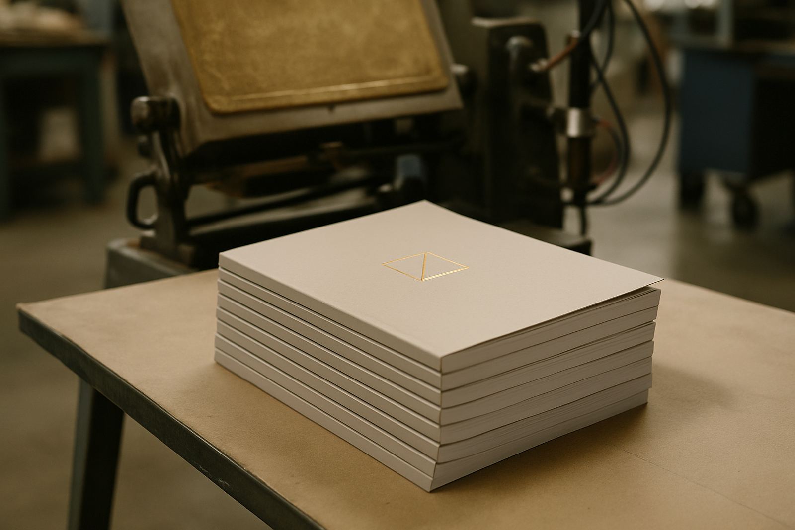
Foil is best used where emphasis matters more than decoration. A title, series name, edition mark or logo is usually enough. If every panel is foiled, the effect can become cluttered and the cover may start to look more like a gift item than a serious publication. The strongest results usually come from restraint.
- Use foil for a title that needs to stand away from a dark or busy background
- Use it for premium magazines, commemorative issues and collector editions
- Use it where a publisher wants a neat retail look without heavy varnish or raised print
- Avoid it on covers with very fine type that may not hold well on press
- Avoid it if the design already depends on strong photography and bold colour blocks
A practical rule is this: if the foil is doing the same job as the main image, it is probably too much. If it supports the design and helps the reader find the title quickly, then it earns its place.
How foil behaves on different cover stocks
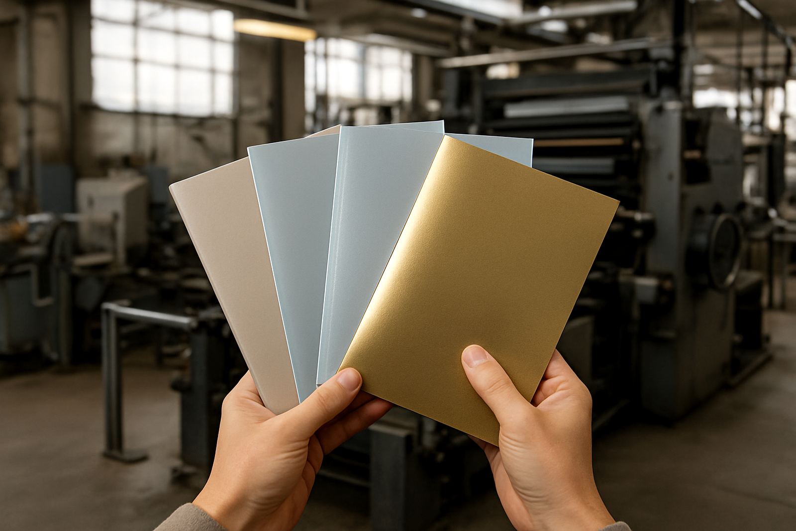
Not every cover stock accepts foil in the same way. A coated cover usually gives sharper detail than an uncoated one, while a laminated cover can protect the finish and help it stay neat during packing and distribution. For books that move through schools, bookshops or conference venues, that extra protection can be important.
At the production stage, the artwork needs enough clear space for the foil to sit cleanly. Thin lines and tiny text may fill in, especially on detailed covers. In humid conditions near the coast, stock movement can also affect registration, so the prepress check needs to be careful before plates are made and finishing begins.
- Coated board gives cleaner edges for fine foil detail
- Lamination can protect foil during transport and handling
- Heavy board suits case bound books and special editions
- Matte covers give strong contrast for metallic or coloured foil
Foil and the rest of the finishing process
Foil rarely works alone. It is usually part of a wider finishing plan that includes lamination, die cutting, saddle stitching, perfect binding or case binding depending on the publication. If the cover is going to be folded, trimmed or stitched, the foil positions need to be set with that in mind from the start.
For magazine covers, foil is often best on the masthead or issue line so the rest of the cover can still carry strong photography and pricing details. For books, it is often used on the spine and front cover together, especially where the title has to read clearly on a shelf. In a print run for a Johannesburg publisher with deliveries to Durban, Gqeberha and Bloemfontein, a smart foil plan can help the book keep its appearance after packing, courier handling and store display.
- Plan foil before final artwork approval, not after
- Check spine width carefully on perfect bound books
- Allow for trim and folding so the foil does not sit too close to the edge
- Match foil to the binding style and distribution route
When foil is a good investment for publishers
Foil is worth considering when the cover has a commercial job to do. That includes launches, anniversary editions, course books, collector magazines and business publications that need a more formal look. If the title will be sold through retailers, displayed at events or handed out to sponsors and stakeholders, foil can help it feel more deliberate.
It is less useful when the run is purely internal, the cover changes often, or the project needs to stay tightly priced. In those cases, a well set cover with good colour proofing and clean lamination may be enough. The question is not whether foil looks attractive, but whether it helps the publication do its job.
- Best for launches, premium titles and special issues
- Useful where the cover needs shelf impact
- Helpful for brands that want a polished but practical finish
- Less suitable where budgets are tight and turnover is fast
A local example from Industria to nationwide delivery
A publisher in Sandton may bring in a 96 page magazine for a year-end issue with a foil title on the front cover. The artwork is simple, with one strong photograph and a metallic title line. During prepress, the foil area is checked against the trim and the proof is approved before production. The magazines are printed, bound and packed for dispatch from Industria, then sent to offices and retail points across Gauteng and beyond.
That kind of job shows why foil is not just a decorative extra. It helps a publication present well in person and still arrive neatly after delivery. For publishers working through load-shedding, courier deadlines and busy distribution schedules, a finish that is planned properly from the start saves trouble later.
Printing House in Industria works with publishers, authors and businesses across South Africa on offset and flexo printing, with finishing choices set to suit the publication and its use. The right foil placement can make a cover clearer, more memorable and easier to recognise without making the design overdone.
How to decide if foil belongs on your cover
If you are unsure, start with the cover’s purpose. Is it meant to sell, mark a milestone, support a brand, or sit on a shelf for months? The answer usually points to the right finish. Foil suits publications that need a neat focal point and a more polished first impression, especially where the title must read quickly.
Before approving foil, ask a few practical questions and not just design questions.
- Will the foil still be readable from a distance?
- Does the stock suit the finish?
- Will binding or trimming interfere with placement?
- Does the budget allow for a finish that adds real value?
- Will the publication travel well through packing and dispatch?
If the answer to most of those is yes, foil is probably a sound choice. If not, a simpler finish may work better and keep the project on budget.