
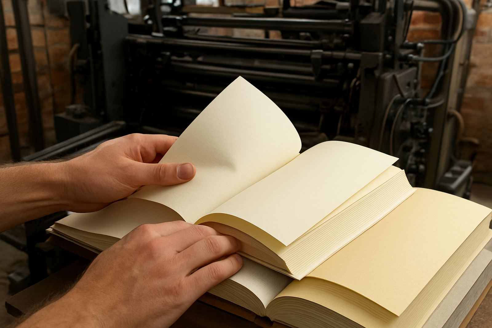
Why paper feel changes the whole reading experience
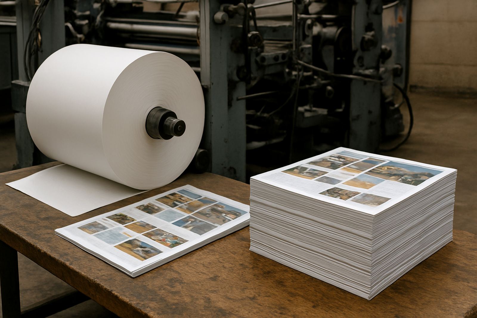
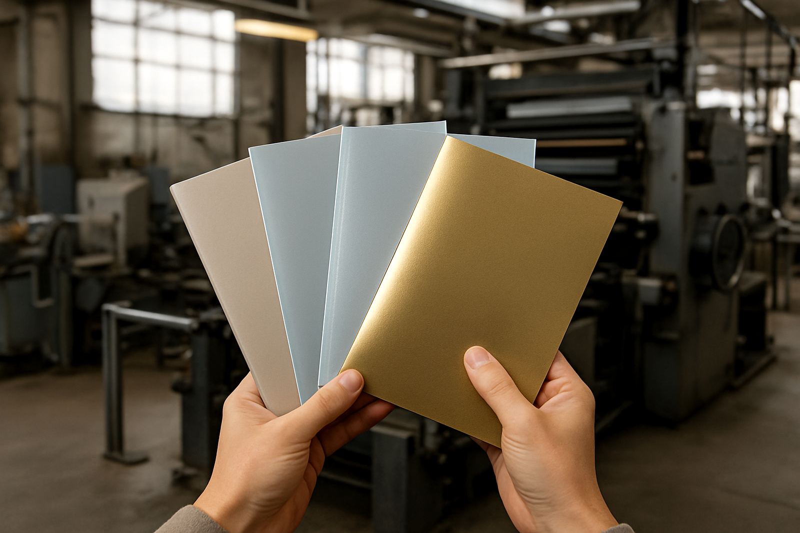
When someone picks up a publication, the first thing they notice is not the text block, it is how the paper feels. A smooth sheet gives a cleaner, sharper look for fine detail, while a more textured sheet softens the appearance and can feel warmer in the hand. That choice matters for books, magazines, reports and catalogues because people often form an opinion before they read the first line.
In Johannesburg, where publishers and businesses often compare several print options in one meeting, paper feel is part of the practical brief. A trade paperback for long reading sessions needs a different feel from a magazine with strong photographs. A children’s title that will be handled often needs a different surface again. If the paper feels too light, pages can seem flimsy. If it feels too heavy, the book can become tiring to hold.
Paper texture also affects the way ink sits on the sheet. A coated sheet can keep colours crisp, which helps with image heavy work. An uncoated sheet absorbs more, which can reduce shine and make text easier on the eye. The right choice depends on the content, the binding style and how the publication will be used. We often see publishers change paper after a proof round because the printed sample simply does not match the reading experience they wanted.
Texture, coating and handling all shape the feel of a page
Texture is not only a visual matter. It changes grip, page turning and how a publication ages in circulation. A slightly textured sheet gives fingers more purchase, which can help when pages are turned quickly. That can be useful in manuals, training guides and programme booklets. A smoother coated sheet feels neater and more polished, but on some jobs it can show fingerprints more readily, especially in busy retail or event use.
Paper choice also matters in humid coastal areas. A magazine delivered to Durban or Gqeberha may pick up moisture faster than one used in dry inland conditions, so the stock and finishing need to suit the route and the end use. Gloss and matt coatings behave differently in storage, and lamination can give added protection where the publication will be handled often. For publishers shipping nationwide, that is not a small detail, it is part of getting the job there in good condition.
Before confirming a stock, look at these points:
- Will the reader keep the publication or use it once and discard it?
- Does the work rely on photography, fine type or both?
- Will the publication move through multiple hands before reaching the reader?
- Is the final destination inland, coastal or exposed to heavy handling?
Bulk, thickness and why a book can feel more substantial
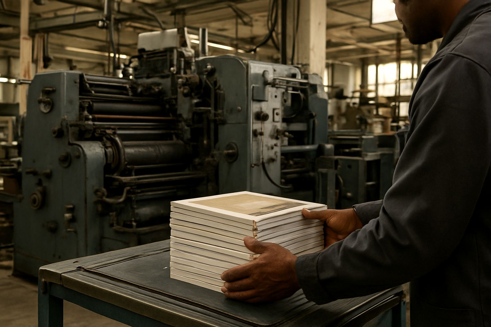
Bulk is about how thick the paper is for a given grammage. Two papers can both be 115gsm, yet one may feel fuller because it has more volume. That changes the spine width, the page count feel and the way the book opens. For perfect binding and case binding, bulk has a direct effect on how the finished item sits on a shelf and in the hand.
A book often feels substantial before the reason is obvious. Usually that comes from a combination of bulk, cover board choice and binding method. A low bulk sheet may make a long book look slimmer, which can suit a concise corporate report. A higher bulk sheet can make a fiction title feel more generous without adding too much weight. For magazine work, bulk also affects the stack height, packing and dispatch costs, and how many copies fit into a carton or onto a pallet.
At our Industria base, we see this often with publishers balancing postal rates and shelf presence. A title aimed at bookstores in Sandton may need a different presentation from a bulk shipment going to schools in Pretoria or distributors in the East Rand. The point is not to choose the thickest stock. It is to choose the stock that matches the reading time, transport conditions and binding method.
Matching paper to offset and flexo jobs
Offset printing is usually the first choice for books and magazines where detail, colour control and fine finishing matter. It gives strong results on a wide range of paper types, from smooth coated stocks to more natural uncoated papers. Flexo printing is useful on certain publication and packaging related work where the format and material call for it. In both cases, paper texture must suit the press setup and the finished purpose.
Prepress checks and colour proofing are important here because paper changes the way colour reads. A bright white sheet will usually make contrast stronger, while a cream sheet can soften the page and make long reading easier on the eye. If the job uses photographs, a coated paper may hold detail better. If the publication is mostly text, a calmer surface may be the better fit. That is why proofing on the actual chosen stock is worth the effort.
When planning a print run, ask for attention to these practical points:
- Paper whiteness and how it affects text contrast
- Surface finish and whether it suits photos or long-form reading
- Bulk and how it changes spine width
- Binding compatibility with saddle stitch, perfect binding or section sewing
Binding choices that depend on paper feel
The paper you choose should work with the binding, not fight it. Saddle stitching suits slimmer magazines and booklets, but page count and paper bulk need to stay within practical limits. Perfect binding is common for trade books and thicker publications, yet the paper needs to open well without stressing the spine. Case binding gives a more formal finish and often calls for careful paper selection so the book opens properly after handling.
Section sewing is useful where longevity matters, especially for reference books and titles that will be used repeatedly. In those cases the internal paper must support repeated opening without excessive cracking at the spine. Cover lamination, foil finishing and die cutting can all improve presentation, but they work best when the paper and binding have been planned together from the start. A nice cover cannot rescue a poor internal stock choice.
We often advise clients to think about the reading behaviour of the final audience. A daily-use training manual, a gallery magazine and a school reader all need different combinations of feel, thickness and binding. Getting that mix right helps the publication stay useful for longer and reduces complaints after delivery.
A Johannesburg print run with a practical paper decision
A publisher in Johannesburg needed a magazine-style title for distribution across Gauteng and out to Bloemfontein, Polokwane and coastal branches. The first paper sample looked smart, but once the proof was checked and the reading experience discussed, it was clear the stock was too slick for the amount of text inside. People would spend long periods with it, so the page needed a softer feel.
We moved to a slightly more textured sheet with enough bulk to give the publication presence, then used careful colour proofing to keep the images clean. The result was a title that still looked professional, but felt better in the hand and opened more easily. Because the finishing, packing and dispatch were planned at the same time, the cartons travelled well and arrived ready for distribution. That sort of practical adjustment saves time later and keeps the print run aligned with the actual use of the publication.
If you are comparing paper options, it helps to bring a few real details to the conversation:
- Page count and trim size
- Where the publication will be read and stored
- Whether photographs or text carry the main message
- How long the reader is expected to keep it
Choosing paper with the final reader in mind
Paper feel is easy to overlook when the focus is on artwork, deadlines and budgets, but it has a direct effect on how people use a publication. Texture changes grip. Bulk changes presence. Coating changes the way ink behaves. Binding changes how long the product lasts in circulation. When those details are planned together, the result feels considered rather than accidental.
For publishers, authors and businesses, the best paper choice is usually the one that fits the job without forcing the reader to notice it. A title should open naturally, sit comfortably in the hand and survive the conditions where it will actually be used. That may mean a smoother stock for image led work, a bulkier sheet for a longer book, or a tougher finish for repeated handling. Small choices make a big difference once the publication leaves the pressroom.
Printing House works with clients from Industria, Johannesburg Central, Sandton, Randburg, Roodepoort, Midrand, Pretoria and the East Rand, with delivery to publishers nationwide. If you are planning a book or magazine run, it is worth checking the paper early, before the production line is fixed. A better paper decision at the start can improve the reading experience from the first page to the last.