
Why school photos look different on screen and on paper
A photo that looks fine on a phone can disappoint once it is printed at A4 size. Screens can hide softness, noise and poor lighting, but paper shows every problem, especially in group shots where faces are small.
For yearbooks, the aim is not just attractive pictures. It is legible faces, clean skin tones and enough detail to hold up in a full colour press run. That is why image review must happen before layout is finalised, not after the pages are already signed off.
Resolution that works for yearbook pages
Resolution is the first check we make. For portraits and most page images, 300 dpi at final print size is the usual target. If a photo is stretched beyond what it can carry, it becomes soft and blocky. That is hard to fix later.
- Single portraits should be supplied large enough for at least 300 dpi at the final crop size.
- Group photos need even more care because faces are smaller and detail matters across the full frame.
- A vertical image used as a full-width banner will need more pixels than the same image used as a small inset.
- Smartphone images can work, but only if they were taken in good light and not heavily cropped.
In Johannesburg schools, we often see photos taken in mixed indoor light with a window behind the subject. They may look acceptable on a screen, then print with flat faces and blown-out backgrounds. A quick resolution check before approval saves time and avoids reprints.
Colour correction that keeps skin tones natural
Colour correction is just as important as resolution. Yearbook photos need consistent skin tones across many photographers, devices and lighting conditions. One class photo should not look warm and orange while the next looks cold and grey.
Good correction also deals with school uniforms. Blazers, ties and badges need to hold their real colour. If blue shirts push too far toward purple, or red jerseys print too dark, the whole page feels off. This is where prepress checks and proofing make a real difference.
- White balance should be corrected before pages go to press.
- Over-sharpened images should be softened slightly so edges do not print harshly.
- Faces should keep detail in the highlights and shadows.
- Group shots must match the rest of the book so the spread feels planned, not patched together.
Cropping mistakes that ruin a strong photo
Many yearbook problems come from cropping, not the original picture. A good image can be damaged if the head is cut too close, a shoulder disappears, or a class photo is trimmed so tightly that the back row is difficult to read. In print, there is no zoom button to rescue that mistake.
The safest approach is to keep enough space around each face and allow for trim during binding. This matters even more on saddle stitched books, where page creep can affect margins near the spine. For perfect bound yearbooks, the inner margin should be planned with care so names and faces are not swallowed by the binding.
What publishers and schools should check before sign-off
A simple checklist helps schools avoid expensive corrections. It also keeps production moving, which matters when yearbooks have to be delivered before prize-giving or graduation week.
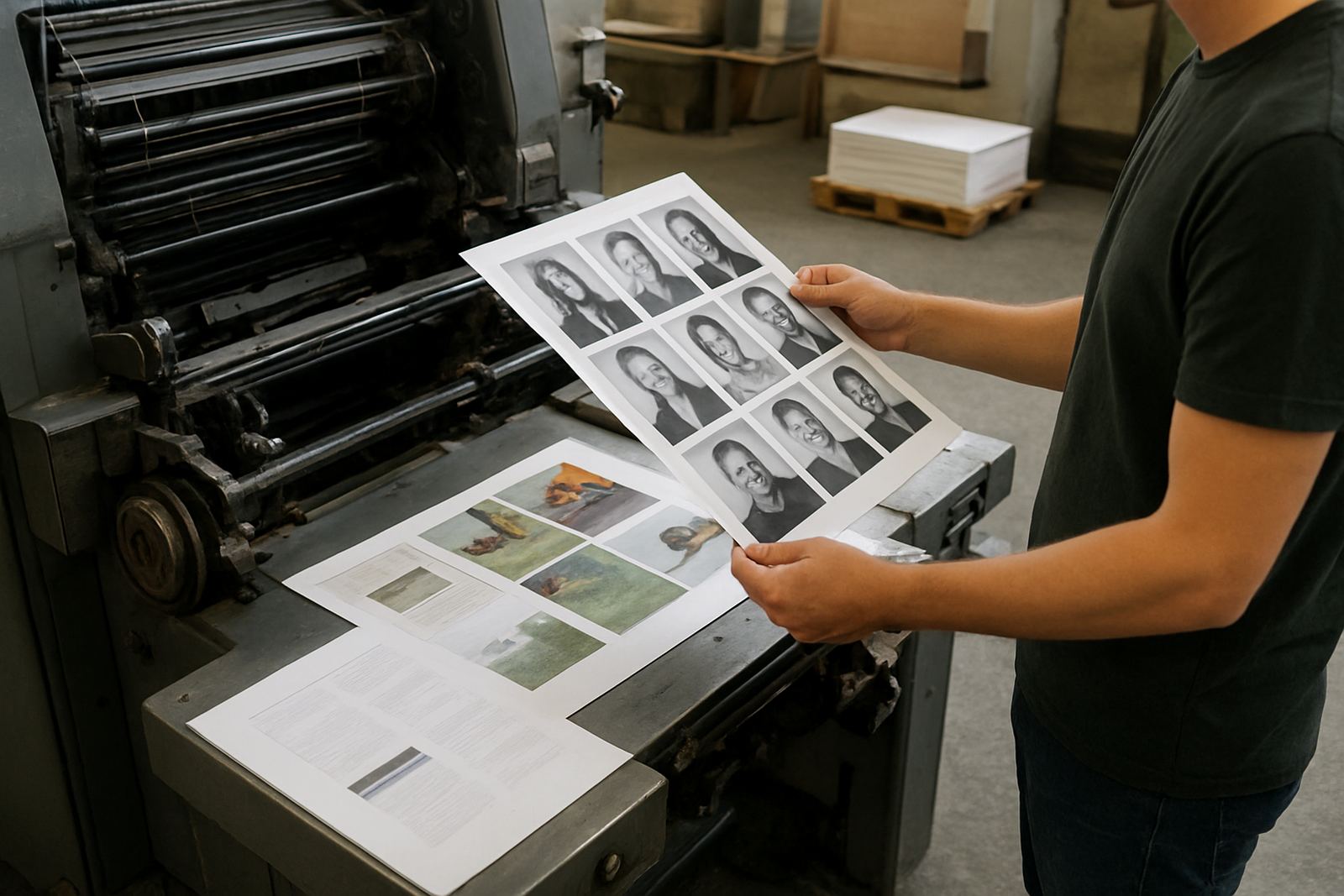
- Check every photo at actual print size, not only on screen.
- Confirm that faces are clear in class photos and sports team images.
- Make sure logos, uniforms and captions are aligned with the correct year and spelling.
- Remove images with heavy blur, harsh flash, or visible compression.
- Compare proof pages from the first section with the final section so colour remains consistent.
For schools in Pretoria, Sandton, Randburg and the East Rand, delivery timing often depends on term calendars and venue bookings. If books are going to multiple branches or alumni groups, pack lists must be correct so the right quantity reaches the right campus without confusion.
A local example from a Johannesburg school run
A school in Midrand sent through a mix of studio portraits, sports images and older candid shots from different cameras. The portraits were crisp, but the event photos varied a lot in exposure. Some pupils stood near bright windows, others were under gym lights, and a few pictures had been cropped too tightly by the original photographer.
By reviewing the files early, the weak images were replaced, the remaining ones were corrected for contrast, and captions were checked against the final class list. The result was a yearbook where the pages matched from cover to cover, with clear faces and better balance across the spreads. That kind of preparation is especially useful when the book has to go to schools around Johannesburg Central, Industria, Roodepoort and further afield in one dispatch cycle.
Printing conditions that affect the final look
Even with good photos, print conditions still matter. Paper choice, ink control and finishing all influence the final result. On a gloss cover, colours can appear brighter. On a matte interior stock, detail may look softer but easier to read under classroom lighting. Finishing choices such as lamination and foil can add value on the cover, but they should never distract from photo clarity inside the book.
Load-shedding and humidity can also affect production planning in South Africa. If the schedule is tight, files should be finalised early enough for proofing, presswork, binding and packing without last-minute pressure. That reduces errors and helps ensure the yearbooks leave Industria on time for delivery nationwide.
What good photo preparation saves in the end
When image resolution and correction are handled properly, the yearbook feels orderly and worth keeping. Faces are clearer, group shots are easier to read, and the book has a steadier visual rhythm from the first page to the last. Schools do not need to overdo editing, but they do need discipline around file quality and proof approval.
For publishers and school administrators, the lesson is simple: better source images mean better print results. A strong yearbook is built long before it reaches the press, and the time spent on checks almost always shows in the finished book.