
Start With The Right Page Size And Trim
The first check is simple: make sure your artwork matches the final finished size. A novel, annual report and catalogue may all look neat on screen, but if the page size is wrong the binder will cut into text or leave uneven margins. Set the trim size from the start, then build the document around it. For saddle stitched magazines, remember that page counts must be in multiples of four. For perfect bound books, allow enough spine width for the paper stock and page count, otherwise the cover will not close cleanly.
Also watch the difference between the live area and the trim area. Keep text, page numbers and key images safely inside the live area, with enough space for guillotining and binding. In Johannesburg we often see short-run reprints for schools and corporates where the file was laid out for screen reading, not for paper. That usually means headlines too close to the edge and notes hidden in the binding gutter.
Build Bleed, Margins And Gutter Space Properly
Bleed is not optional when artwork runs to the edge. Add it on every side that prints full colour to the edge, especially on covers, spreads and full-page photographs. A missing bleed can leave a thin white line after trimming, and that looks untidy on any publication. Margins matter too. If your inside margin is too narrow, the text will disappear into the binding on thicker books and stitched reports.
- Use bleed on all pages with edge-to-edge colour or images.
- Keep important text well clear of trim lines.
- Add extra gutter allowance for perfect binding and case binding.
- Check that facing pages line up correctly in spreads.
For long publications, review the innermost pages separately. The fold and trim can shift slightly, so a design that looks fine on page 12 may need a different treatment on page 128. That is especially true when you are printing on heavier coated stock for magazines or presentation reports.
Check Images, Colours And Proofs Before Approval
Images should be supplied at print quality, not at web size. A low-resolution photo may look acceptable on a laptop, but on press it will show soft edges and blocky detail. As a rule, photos need proper resolution at final size, and line art must be sharp. If you are using charts, graphs or scanned documents, inspect them closely for jagged edges, missing digits and faded labels.
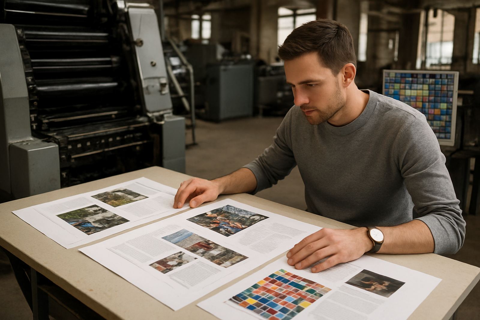
Colour is another area where files often need attention. What you see on a backlit screen will not match printed paper exactly, so a proof is important before a full run. This is especially true for brand colours, skin tones and dark backgrounds. A quick proof can save a great deal of trouble later, particularly when a magazine issue has adverts from different sources and each one was prepared by a different designer.
- Check that all images are linked correctly and embedded if required.
- Confirm black text is pure text black, not rich black.
- Review overprints, transparencies and image trapping.
- Ask for a proof on the actual paper where possible.
Fonts, Spelling And Hidden File Problems
Fonts can break a job if they are not handled properly. Always embed or outline fonts according to the file requirements, and check that special characters still display correctly. If a font changes on output, your headings may reflow and push paragraphs onto the next page. That means a clean layout on screen can turn into a messy one at print stage. It happens more often than people think, especially when files have been passed between multiple designers or offices.
Proofreading is just as important. Print files should be checked for spelling, repeated words, missing captions and inconsistent styles. A report with one changed figure can become a costly reprint if it reaches the bindery first. It is worth printing a low-cost laser copy and reading it line by line, because the eye catches mistakes on paper that are easy to miss on a monitor.
- Embed all fonts or convert them to outlines where required.
- Remove unused colours, swatches and hidden layers.
- Check that page numbering runs correctly from start to finish.
- Run a spell check, then do a human read-through.
Prepare For The Finish: Stitching, Binding And Cover Work
Your finishing choice affects the file setup. A saddle stitched magazine needs a different approach from a case bound title or a section sewn report. Covers must allow for spine thickness, board wrap and any lamination or foil finishing. If the cover artwork is tight to the trim, the cutter may take away important detail. If the spine text is placed too close to the folds, it may wrap unevenly or disappear into the hinge.
For books with section sewing or case binding, ask for the exact board size, spine allowance and hinge requirements before you finalise the artwork. On heavy publications, a slight adjustment of a few millimetres can make the difference between a tidy product and one that opens badly. In industrial printing, small measurements matter. It is the kind of detail that saves time on press and gives the finished publication a cleaner result.
- Confirm the binding method before you set the cover.
- Allow extra space for spine text and hinge folds.
- Make sure folds, creases and cuts are marked clearly.
- Leave room for lamination, foil or die-cut features.
A Simple Local Check Before You Send It Through
If you are in Sandton preparing an investor report, or in Pretoria finishing a magazine for distribution, do one last practical check before submission. Print the pages at actual size, check the binding side, and flip through the order from front to back. Confirm that the cover matches the content, that barcodes or issue details are correct, and that the final PDF is the same version everyone signed off. One wrong export can undo hours of work.
It also helps to use a short handover list when sending files for print. Keep one person responsible for approval, and make sure everyone else has already signed off on copy, images and layout. A clear file naming system, such as title, version and date, makes it easier to spot the final document quickly. That matters when deadlines are tight and the load on the production floor is already set for the day.
- Print a final copy at full size and review it page by page.
- Check version numbers and file names before sending.
- Keep all support files in one folder if requested.
- Approve only after copy, layout and colour are all signed off.
When To Ask For Prepress Help
Not every file needs rescue, but many benefit from a proper prepress check before they go to plate. If you have a long publication, a mixed set of adverts, or a job with several binding stages, it is worth asking for a review early. A prepress supervisor can spot missing bleeds, low-resolution images, bad overprints and folding issues before they become production problems. That is especially useful for publishers who need nationwide delivery and cannot afford delays once the run is under way.
For local publishers, schools and businesses across Johannesburg, Midrand, Randburg and the East Rand, the safest approach is to prepare carefully, then let the print team verify the technical details. Good print files do not happen by chance. They come from a clean process, a careful eye and enough time to check the small things before the machines start moving.